ShopDreamUp AI ArtDreamUp
Deviation Actions


Suggested Deviants


Suggested Collections


You Might Like…


Featured in Groups


Description
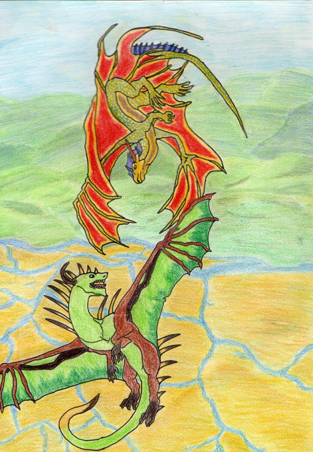
Hope you guys like it  (Smile)") I went and bought a book on drawing dragons. It's absolutely wonderful and it's helped a lot. Anyone who takes a second to leave me constructive criticism so I'll learn from my mistakes is greatly appreciated
I went and bought a book on drawing dragons. It's absolutely wonderful and it's helped a lot. Anyone who takes a second to leave me constructive criticism so I'll learn from my mistakes is greatly appreciated
Image size
2248x3240px 3.53 MB
© 2013 - 2024 Howlingwolf246
Comments14
Join the community to add your comment. Already a deviant? Log In
In a forum thread far far away, you requested a critique on your piece so here we go.
Your designs are nice and i like the difference of body types between the dragons along with their colour schemes. The vertical composition is interesting and dynamic, but there are some things that are bothering me.
The whole scene looks a bit imbalanced and that is also highlighted by the awkward cropping of the bottom dragon's wing. Since you went for this composition, it would be best to place both of the dragons to the middle and certainly show the whole of the wing, or at least show it folded. Another alternative would be to place them diagonally. Just a small tip, generally diagonal lines are more dynamic than straight ones.
The perspective of the background seems distorted, mostly because the bottom half is flat and looks more like a medieval map. The rivers should look more like horizontal lines, if they flow on flat ground. The best advice i can give you here is observation and then some more. Also, since the scene is on the air, i think it would benefit if you showed more of the sky and clouds and less of the ground level.
Another little thing i'd like to point out is the interaction of the characters with the scenery. They both interact with each other and by showing that, you add that more realism to your piece. Here, for example, the bottom dragon's spikes could be pointing upwards to show movement, add flowing debris etc
So, generally it's a good work and i really like how you're going with the designs. Hope i helped in some way !